Eddie by Giddy Redesign
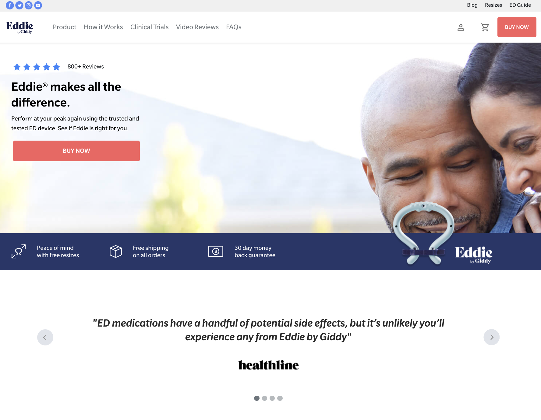
The Eddie by Giddy is a medical device designed to help men with erectile dysfunction (ED).
A comprehensive site redesign, elevating the website and brand to spotlight a premium luxury product.
-
Timeline
3 Weeks
-
Team
Creative Director, 3 UX Designers, Motion Designer
-
My Role
UX Designer, Developed Design System & Prototypes
-
Tools Used
Figma
The Problem
We have observed that people experiencing erectile dysfunction need a user-friendly and informative digital platform in order to facilitate their informed product selection and ultimately improve their sexual health and well-being. The current website for Eddie doesn't provide a smooth and user-friendly flow for exploring and acquiring this solution.
The Goal
The overarching goal was to transform the user's experience by introducing captivating designs, streamlining purchasing flows, refining the user journey for intuitive navigation, and transforming complex technical information into user-friendly content through the use of multimedia elements. The project was initiated as a strategic effort to bring all our company's sub-sites under a cohesive flow, ensuring that all assets worked together synergistically, thereby encouraging cross-traffic among our brands instead of operating independently.
Design Process
Define
Prototype
Discover
Ideate
Test
Discover & Define
Understanding the User
To gain valuable insights and drive user-centric design decisions, we turned our attention to the existing customer base of Eddie by Giddy. Our approach centered on drawing from the experiences and feedback of these users. By engaging directly with current Eddie by Giddy customers, we aimed to identify and address their pain points with the existing website and their user journeys. This hands-on approach allowed us to pinpoint specific areas in which the website could be enhanced to better align with their needs and expectations, ensuring that our redesign efforts were rooted in the real-world experiences of those who matter most – the users.
Pain Points
Sizing Struggles
Users frequently face challenges finding the correct product size, resulting in the need for resizes.
Information Accessibility
Users encounter difficulties in accessing comprehensive product information, understanding its functionality, and expressing skepticism about its effectiveness.
Visual Inconsistency
The site's visual appearance lacks consistency and does not align with the intended brand identity and goals.
User Persona
Mark Miller
He/Him
Married
65 years old
Retired Accountant
United States
“My wife and I haven’t been intimate in years. I need a non-invasive solution to rekindle our relationship.”
Background
Married for 43 years. Prostate cancer survivor. Long career in accounting at a corporation. Upper middle class. New to retirement. Him and his wife are hoping to spend a lot of time with family including new grandkids as well as take trips just the two of them.
Goals
Regain the ability to have a fulfilling and intimate relationship with his wife
Seeks an ED solution he can trust for its quality and effectiveness
Pain Points
Frustrated with previous treatments that didn't work or were uncomfortable
Overwhelmed with information about treatment options
Evaluating the existing site
We conducted a thorough evaluation of the current site. This comprehensive approach identified specific areas in navigation and design that needed improvement, enabling us to focus our efforts effectively.
Key Takeaways
Ineffective Information Presentation
The current site struggles to display information effectively, resulting in a confusing and challenging user experience.
Lack of User Engagement
The site falls short in engaging users effectively, failing to guide them towards product purchases and keeping them invested throughout their journey.
Visual Inconsistency
The site's visual elements lack consistency and aesthetics, failing to meet the standards of a luxury premium product presentation.
Unclear Navigation
The site's navigation is cluttered and unclear, making it difficult for users to find their way around due to excessive complexity.
Ideate
Exploring the Possibilities
Our journey to address user pain points and improve the existing site began with innovative idea exploration. We conducted a comprehensive competitor analysis to identify market gaps, enabling us to stand out. Several site map iterations were crafted to ensure seamless user navigation while meeting technical requirements, enhancing both user-friendliness and overall site organization.
Solutions
Streamlined Sizing & Purchase Pathway
Establishing a more efficient user flow, simplifying the process of selecting the right product size and completing a purchase.
Intuitive Information Architecture
Information is now thoughtfully structured with a clear hierarchy, enabling customers to easily access relevant content. The website's organization tells a coherent and user-centric story.
Engaging Brand Consistency
We've introduced engaging and interactive elements throughout the site, aligning with the brand's premium luxury goals and fostering a consistent, captivating user experience.
Site Map
Developing our sitemap presented a unique challenge as we grappled with integrating the structure of our site, given the bifurcation between the e-commerce section hosted on Shopify and the remaining content managed through CMS. Our primary objective was to guide all users through a consistent flow, ensuring they first engage with a sizing quiz before proceeding to a purchase. This strategic approach aimed to address one of our major pain points: customers ordering the wrong size and subsequently experiencing issues with their Eddie purchase.
Prototype
Starting the Design
Embarking on the design phase, we initiated with the creation of a low-fidelity prototype for quick testing and iteration. Simultaneously, we developed a style guide to maintain visual consistency and elevate the brand's premium image throughout the Eddie website. This dual approach marked a crucial step in translating ideas into effective design solutions.
Lo-Fi Mockups
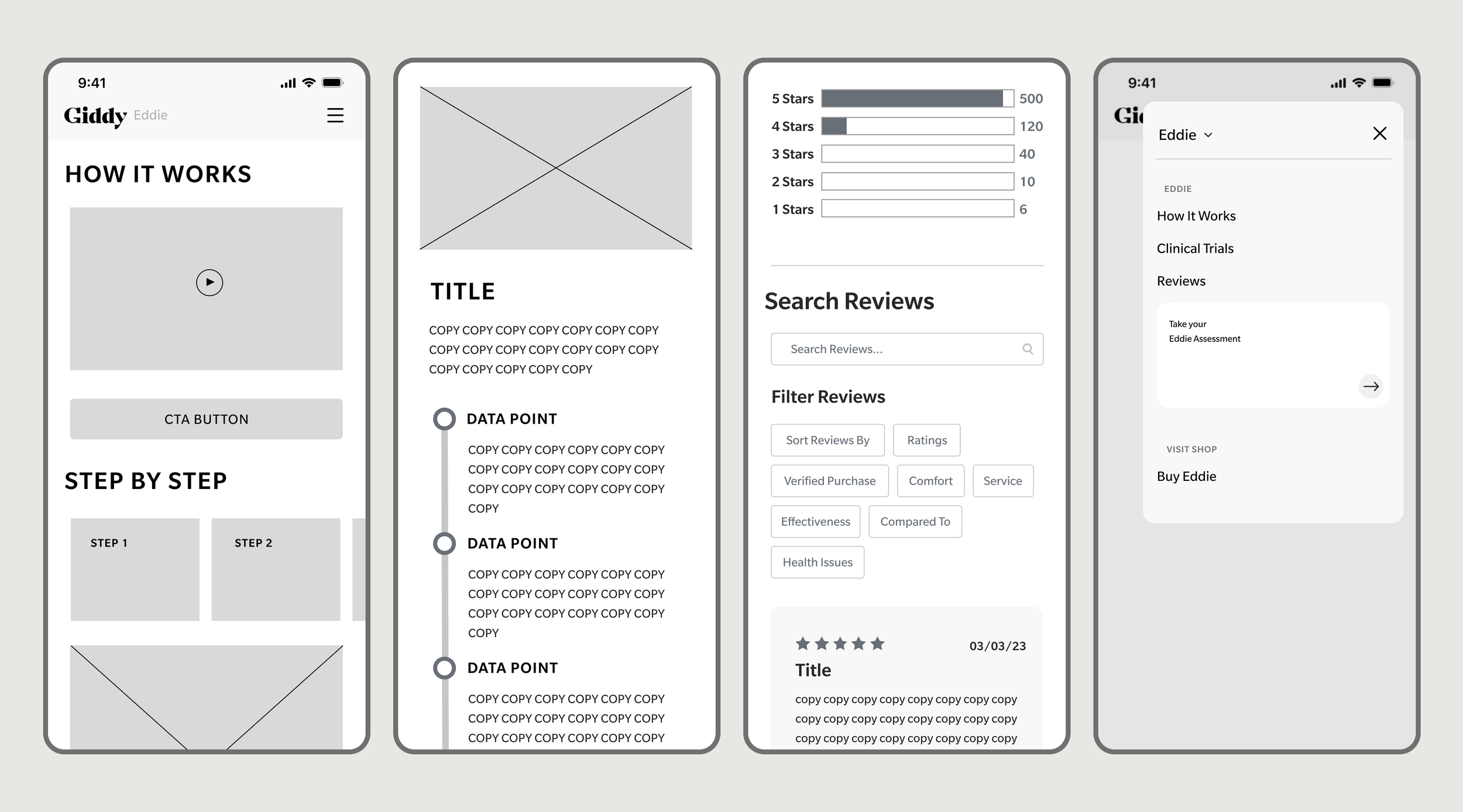
In our early design phase, we focused on creating low-fidelity mockups for the Eddie site with a specific emphasis on structuring the navigation. We began by outlining sections of content for each page, knowing that a deeper dive into these would come later in the design process.
Key Takeaways
Streamlined Navigation
We decided that Eddie should have its own separate, independent navigation, detached from the sub-sites of the company. This approach significantly simplified the user's journey and ensured a seamless experience.
Enhanced Content Organization
We aimed to better organize the content on our pages and within sections to guide users through a coherent learning journey, helping them understand and determine if Eddie was the right solution for their needs.
Brand Aesthetic Elevation
As we moved forward, it became evident that we needed to reimagine all the sections of our existing site to elevate our brand's aesthetic, in line with our goal of positioning Eddie as a premium luxury product.
Style Guide
The style guide played a pivotal role in maintaining visual consistency across the Eddie website. Leveraging the existing design elements, we streamlined color palettes, typography, and design styles. By establishing clear rules for style usage, this guide ensured a cohesive and unified look and feel throughout the site, aligning with the brand's premium identity and simplifying the design process for enhanced user experiences.
Testing & Iteration
Refining the Design
Hi-Fidelity Prototype
The creation of our high-fidelity prototype marked the culmination of a collaborative endeavor. Our design team joined forces with the copy, photo, and motion graphics teams, pooling our collective expertise to portray interactions and visual elements to the highest standard. Leveraging Figma, we meticulously crafted the prototype, ensuring it accurately represented our design vision for the development hand-off. In this critical phase, we maintained close collaboration with our development counterparts, aligning on technical feasibility and ensuring a seamless transition from design to implementation. This holistic approach allowed us to deliver a final prototype that not only met our creative objectives but also facilitated a smooth execution of our vision.
Homepage
Our homepage is designed to make a powerful initial impact. Through engaging visuals and a scrolling narrative, we tell the story of Eddie and provide key information, ensuring a compelling user experience. Some requirements of this page were:
Prominent CTA
A persistent "Buy Now" button ensures easy access for users, prompting immediate engagement.
Informative Sections
Distinct sections that precisely define Eddie's purpose and functionality, verifying the science behind it. Additionally, showcasing testimonials from doctors, publications, and satisfied customers for credibility.
Engaging Visuals
Incorporating visually striking graphics that portray Eddie as a premium device, enhancing the overall appeal and credibility of the product.


